

Community Week

Table of Contents
This article has four main topics:
Legend:
 - Works in dA for All Members
 - Doesn't work in dA for Premium Members
  - Works in dA for Alpha Testers at :devdevbug:
What is a Transition?
This time, I'll explain with an example. Let's take this awesome emote
 by jahw.
 When I see that emote, I'm imagining it saying "CHAAAARGE!" and running forward! So I want to make the emote do that, but instead of opening it up in Photoshop to animate (which I'm not allowed to do anyway since it's not my work), I'm just going to add a simple code that will do the animation for me! Hover over the emote below to see this magic in action!
Fig. 1 - Hover over the emote
Now on to the technical definition
 Basically transition allows the coder to change CSS properties smoothly from one value to another over a given duration. Whereas without CSS3, this is how the emote would change distance on hover:
As you can see the change looks very abrupt and unrealistic. But thanks to CSS3's transition property, we can make our webpages attractively interactive by animating CSS properties from its old state to the new state over a period time.
Now that's what I'm talking about!

Transition-property
This specifies the name of the CSS property to which the transition is applied. For the example in Fig. 1, the CSS property I used to change was the padding-left. I could also have used left or magin-left to achieve similar results.
Fig. 1 - transition-property: padding-left;
CSS
img{
padding-left: 0;
transition-property: padding-left;
/* Webkit Browsers */
-webkit-transition-property: padding-left;
/* Firefox */
-moz-transition-property: padding-left;
/* Opera */
-o-transition-property: padding-left;
}
img:hover{
padding-left: 100px;
transition-property: padding-left;
/* Webkit Browsers */
-webkit-transition-property: padding-left;
/* Firefox */
-moz-transition-property: padding-left;
/* Opera */
-o-transition-property: padding-left;
}
Note: Adding just this will not give the smooth effect yet, go to the next section to know how.
Example of CSS properties that can be animated:
position of elements
top bottom left right in length by px or percentage%size of elements
width or height in px or %margins of element with either
margin affecting all margins or
margin-top margin-bottom margin-left margin-right in pxpadding of element with either
padding affecting all padding or
padding-top padding-bottom padding-left padding-right in pxopacity of an element in a numbercolor value in #HEX or rgba() for textfont-size for text in pxtext-shadow for text in shadow-list format: color, x, y, blur;background-color with color valuesborder of element with either
border affecting all borders or
border-edge-color and border-top-width where edge can be changed to top bottom left rightTransition-duration
This property defines the length of time that a transition takes - how long from the old value to the new value? If you do not add this property, the value will be "
0s" by default which means that the transition is immediate and not smooth. By adding a value like 1s, you can see the animation go smoother like in Fig. 1. You can change the duration as you like, if you want it to go slower, it could take 3s instead.Fig. 1 - Click Here for Live Preview
CSS
img{
padding-left: 0;
/* All Browsers */
transition-property: padding-left;
transition-duration: 1s;
/* Webkit Browsers */
-webkit-transition-property: padding-left;
-webkit-transition-duration: 1s;
/* Firefox */
-moz-transition-property: padding-left;
-moz-transition-duration: 1s;
/* Opera */
-o-transition-property: padding-left;
-o-transition-duration: 1s;
}
img:hover{
padding-left: 100px;
/* All Browsers */
transition-property: padding-left;
transition-duration: 1s;
/* Webkit Browsers */
-webkit-transition-property: padding-left;
-webkit-transition-duration: 1s;
/* Firefox */
-moz-transition-property: padding-left;
-moz-transition-duration: 1s;
/* Opera */
-o-transition-property: padding-left;
-o-transition-duration: 1s;
}
As you can see, there should be a transition-duration specified for when the animation takes on hover and when it's off hover. So that it goes smoothly when you point your mouse over it and after you take the mouse off. The time doesn't have to be the same for both. You can make it go slower when it's returning back to its original value.
Go ahead and play around with the duration property here to see it happen in action
 (Smile)")
Transition-timing-function
This property describes how the values used during a transition will be calculated. It allows for a transition to change speed over its duration. For example, if I want an animation to look like it's running from one location to the other, it can start really fast at first like a sprinter in real life does, then go at a slower constant speed, then pick up speed again towards the end. These effects are commonly called easing functions and a mathematical function that provides a smooth curve is used. There's two ways to define the timing functions: a stepping function or a cubic Bézier curve.
A stepping function is easy to understand. It just divides the number of steps into equally sized intervals. The function also specifies whether the change in output percentage happens at the start or end of the interval (in other words, if 0% on the input percentage is the point of initial change). ex:
steps(2, start)
Fig. 3 - Stepping Function
A cubic Bézier curve is defined by four control points, P0 through P3 (see Fig. 4). P0 and P3 are always set to (0,0) and (1,1). The transition-timing-function property is used to specify the values for points P1 and P2.
These can be set to preset values using the keywords like
ease-in or can be set to specific values using the cubic-bezier function ex: cubic-bezier(0, 0, 1, 1)
Fig. 4 - Bézier curve
Keywords with its equivalent in the cubic-bezier
ease = cubic-bezier(0.25, 0.1, 0.25, 1)linear = cubic-bezier(0, 0, 1, 1)ease-in = cubic-bezier(0.42, 0, 1, 1)ease-out = cubic-bezier(0, 0, 0.58, 1)ease-in-out = cubic-bezier(0.42, 0, 0.58, 1)step-start = steps(1, start)step-end = steps(1, end)Fancy Menu Using ease-in
Fig. 5 - Click here to see Template!
In the template I made here I have the code and the html where you can see that the menu class has the transition property in which it eases in when hovered on and hover off.
Transition-delay
This property defines when the transition will start. It allows a transition to start executing after some time when an action is applied. For example, an animation can start 5 seconds after I hover over the element. It is 0s by default which means the transition will execute as soon as the property is changed. Otherwise, the value specifies an offset from the moment the property is changed, and the transition will delay execution by that offset.
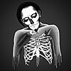
transition-delay: 3s;Fig. 6 - Hover until the image changes
As you can see in the example above, the image doesn't change until after 3 seconds have passed, so the animation doesn't occur until after a certain time that the coder has defined. You can find the template here!
Transition
This basically groups all the four previously mentioned properties together in one property in the following order:
transition: transition-property, transition-duration, transition-timing-function, and transition-delay;Here's how we could use all the properties for one animation:
Fig. 7 - Hover to see effect
I've changed two CSS properties for the example above:
width of the image and the background-color so this is how the syntax would look:transition: width 1s ease-in, background-color 1s ease-in; What if I have too many transition properties with the same timing functions?
Well, quite easily, instead of name ALL the properties and separating them out by commas, you can simply just add
all to your code. (Thanks to jonarific for pointing it out!) So the new syntax would now look like this:transition: all 1s ease-in;That's about all there really is to it!
 If you wanna test your knowledge and challenge your skills, check out the small contest below!
Mini-Contest
For 100
 , create a snazzy drop-down menu using the template provided with transitions and bonus points for whoever makes it look appealing using gradients or any other properties mentioned in previous articles!
Save your work on

and link your snippet in the comments below!
Ends on June 7th
Good luck!

TL;DR - Documentation
transition-property: property;transition-duration: time;steps(integer, start)steps(integer, end)cubic-bezier(number, number, number, number)
cubic-bezier(x1, y1, x2, y2) curve where both x values must be in the range [0, 1] or the definition is invalid. The y values can exceed this range.transition-timing-function: ease;transition-timing-function: cubic-bezier(0.25, 0.1, 0.25, 1);transition-timing-function: linear;=transition-timing-function: cubic-bezier(0, 0, 1, 1);transition-timing-function: ease-in;=transition-timing-function: cubic-bezier(0.42, 0, 1, 1);transition-timing-function: ease-out;=transition-timing-function: cubic-bezier(0, 0, 0.58, 1);transition-timing-function: ease-in-out;=transition-timing-function: cubic-bezier(0.42, 0, 0.58, 1);transition-timing-function: step-start;=transition-timing-function: steps(1, start);transition-timing-function: step-end;=transition-timing-function: steps(1, end);transition-delay: time;transition: transition-property, transition-duration, transition-timing-function, and transition-delay;
All four properties grouped together
Useful Links
CSS3 Animated Journal Skin by DEVlANT
For Non-Alpha Members, if you'd like to try having CSS3 effects look at this great tutorial by Fli-c
If you'd like to learn more about CSS basics, I suggest you have a look at these groups:


Create your own Journal Skin by miontre
Prefix CSS Generator
Test out CSS3 snippets with an instant Live Preview in this CSS Sandbox:


